Desirability
Feasibility
Viability
ROLE
TEAM
OVERVIEW
Problem space mapping: five directions explored before committing to this one
Eight concepts explored: from mini-games hub to a social media platform.
User flow with two primary entry points: create a social, join a social
SKILLS
Ideation
Product Designer
Kelly Mark
Lucas Vu
Jasmine Kumar
Figma
Framer
UX Design
Product Strategy
Shufflr: reducing the activation energy of hanging out
Shufflr is a social planning app for university students. Input your time, budget, and vibe. Shufflr generates a shortlist of activity cards. Pick one and go. The goal was to get from "we should hang out" to an actual plan in under 60 seconds, without a group chat negotiation.
We identified five possible problem directions before choosing one: loss of online discovery and serendipity, creator economy pressure on self-expression, decline of global shared internet moments, loss of contributing versus consuming, and the activation energy gap in social connection.
We chose the activation energy problem because it had the clearest user, the most actionable design surface, and the most direct connection to measurable behaviour. Conceptually interesting problems that are hard to design for in 24 hours are not useful.
Early concepts included a self-building profile that reflects who you are through what you actually do, a digital garden strangers grow together through daily tasks, a social games platform, and a community canvas. Each addressed a different facet of the problem.
The deciding factor was immediacy. The most urgent version of the problem was not how people present themselves online. It was that people were not getting offline at all. That reframe narrowed the field to a planning tool.
This sketch shows the earliest version of the home screen: group chats surfaced upfront, a trending activities module, and a card-based shuffle interaction. The core mechanic was there from the start. The visual design evolved significantly from here but the underlying flow did not change much.
Mapping the problem space
Generating concepts
Lo-fi to hi-fi
How might we reduce the activation energy of spontaneous, in-person hangouts so that authentic connection becomes the path of least resistance?


Problem
Metrics
Reflection
Solution
Why this problem?
Design Process
61% of Gen Z report feeling lonely often or sometimes (Cigna, 2023). University students are physically surrounded by potential friends and still struggle to convert proximity into actual connection. The problem is not access to people. It is the activation energy required to do something about it.
Average daily social media use among 18 to 24 year olds sits above 3 hours (GWI, 2024), with self-reported social satisfaction declining alongside it. The platforms filling that time are structurally incentivised to keep users scrolling, not socialising.
The percentage of weekly active users who complete at least one Shufflr-initiated activity with another person in a given week. This captures whether the product is delivering real-world value, not just app engagement.
The clearest lesson from this project was about problem scoping. We started with a conceptually richer question about identity and authenticity online. The more actionable problem, reducing the friction of hanging out, was less philosophically interesting but more designable, more testable, and more honest about what a 24-hour sprint could actually solve.
If I were taking Shufflr further, the first thing I would validate is whether the shuffle mechanic actually changes behaviour or just feels novel. Retention data after the first week would tell that story quickly, and the Memory Capture Rate would be the earliest signal worth watching.
At the 5pm judge check-in, the feedback reframed how we had been thinking about the problem. We had been designing around authentic self-expression. The judges pushed us toward something more concrete: people were not failing to express themselves authentically online. They were failing to stop bed-rotting.
We restructured the solution framing with two hours left. That conversation is the reason the final presentation landed differently from where we started. Being willing to take that feedback and move on it quickly, rather than defending the original framing, was the real design decision of the day.
Every feature is designed to get users off their phones, not keep them on it. That is an unusual design constraint for a mobile app and it shaped every decision. The shuffle mechanic removes decision friction. The community page removes the awkwardness of cold connection. Captr removes the pressure to perform. The archive is private. The moment belongs to the group.
No existing social platform is optimized for this. They are optimized for engagement, which is the opposite problem.
Socialising feels performative
Decision fatigue kills spontaneity
What we kept and why
What we cut and why
#1: The Shuffle
#2: Interest-Based Proximity Matching
#3: Captr: Memory Capture
Desirability
Feasibility
Viability
Shuffle-to-Hangout Conversion Rate
Memory Capture Rate
7-Day Return Shuffle Rate
Guardrail: Shuffle Abandonment Rate
Proximity does not equal connection
Students know plenty of people they would genuinely like to spend time with but have no low-friction way to bridge the gap. Cold digital outreach feels awkward. There is no infrastructure for the in-between.
72% of Gen Z report feeling pressure to present a curated version of themselves online (Morning Consult, 2023). The rise of the creator economy normalised treating personal experiences as content. Sharing became strategic rather than spontaneous.
72% of Gen Z report feeling pressure to present a curated version of themselves online (Morning Consult, 2023). The rise of the creator economy normalised treating personal experiences as content. Sharing became strategic rather than spontaneous.
Three-input shuffle (time, budget, vibe): keeping the decision surface deliberately small was the most important interaction decision we made. Every additional input adds friction. The product only works if the path from "I'm bored" to "we're going" is genuinely short.
Community page for proximity matching: this was the feature most directly tied to the brief. Finding people through shared physical experience rather than cold digital follows removes the most common barrier to expanding a social circle at university.
Captr, the memory capture feature: a private photo archive builds emotional investment over time. The longer someone uses Shufflr, the more the archive means to them. This is also the feature most directly tied to the nostalgia brief through unfiltered, unaudited moments that exist for the group and nobody else.
The full availability calendar was removed from the primary flow. It added coordination overhead that directly contradicted the core mechanic. It stayed as a secondary logistics feature for groups who needed it but was not part of the main shuffle path.
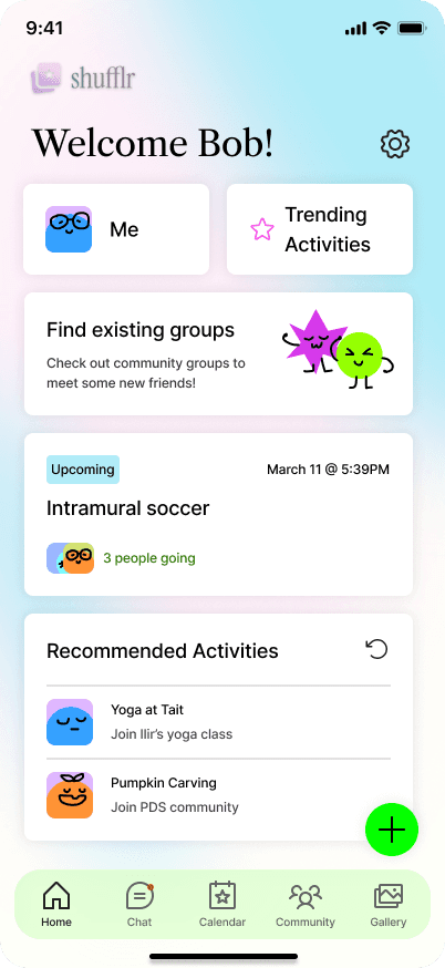
Input time, budget, and vibe. Shufflr generates a curated shortlist of activity cards. Swipe, pick one, done. The decision surface is deliberately small.
The community page surfaces open activities nearby with people who share your interests. Social graph expansion happens through shared physical experience. You show up to the same thing and the connection follows.
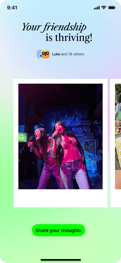
During the hangout, Shufflr prompts your group to take a photo. No filters, no public feed, no audience. It goes into a private group archive. The value of using Shufflr compounds with every entry.
Directly targets the loneliness and social friction most acutely felt by 18 to 24 year olds. The shuffle mechanic reintroduces low-stakes spontaneity at the interaction layer, addressing the nostalgia brief through behaviour design rather than aesthetics alone.
Activity generation and location-based discovery build on existing infrastructure: Google Maps, Yelp, and Eventbrite APIs. Shufflr synthesises these surfaces rather than rebuilding them. Memory capture uses native camera integration with no proprietary backend required at MVP.
The digital archive creates a retention flywheel: emotional investment increases with usage, improving long-term LTV without requiring continuous feature novelty. Campus B2B licensing, considering that universities already budget for orientation and student life programming, provides a clear institutional revenue model that does not depend on individual consumer willingness to pay.
Percentage of generated shuffles that result in a confirmed activity. Primary measure of whether the core mechanic is working.
Percentage of completed activities where a photo is taken. Leading indicator of emotional investment and the strongest predictor of long-term retention.
Percentage of users who generate a second shuffle within 7 days of their first completed activity. Measures whether a single use experience is strong enough to drive habitual behaviour.
Percentage of users who generate a shuffle but take no further action. Flags friction in the decision flow before it compounds into churn.
The brief asked us to design something that recaptures what made the early internet feel alive before algorithms optimized away the rough edges. We spent the first part of the sprint mapping what actually changed after 2016, not just aesthetically, but in how people relate to each other online and offline. Three root causes shaped our entire design direction.
The loneliness paradox
North Star: Weekly Active Completers
Three features. One closed loop.
The decision that changed the presentation
What differentiates this approach?
Feature Validation


Product Design Sprint, 2026
Western Founders Network


1st Place & Most Practical:
